The ‘Universal Khaki’ Era: Why Earth Tones Rule 2026
Interior design in 2026 has officially entered its ‘Bio-Harmonic’ phase. After years of clinical grays and stark whites, we are collectively retreating into the warmth of the earth. The ‘Color of the Year 2026,’ **Universal Khaki (SW 6150)**, perfectly encapsulates this shift. It’s not a boring beige; it’s a sophisticated, tailored neutral that changes with the light, moving from a warm sand in the morning to a deep, grounded olive-taupe in the evening.
Earth tones in 2026 aren’t just about ‘brown.’ They are a spectrum of organic hues—clays, mosses, terracottas, and deep muds—that aim to bridge the gap between our digital lives and our biological need for nature. Here is how to master the 2026 palette.
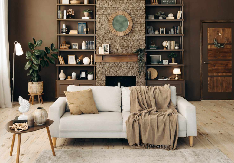
1. The ‘Soft Minimalist’ Palette: Sand, Oatmeal, and Latte
In 2026, we’ve moved past ‘Scandi’ and into **’Soft Minimalism.’** This palette is built on layers of low-contrast neutrals. Think of a beach in winter: the colors of wet sand, dry beach grass, and driftwood.
The secret to making this palette feel luxury (and not ‘bland’) is **Texture Layering**. If your walls are ‘Oatmeal’ lime-wash, your sofa should be a ‘Latte’ boucle, and your rug should be a ‘Sand’ jute. By keeping the colors within three shades of each other but varying the materials, you create a ‘sensory’ room that feels like a hug. This palette is ideal for bedrooms and living rooms where the primary goal is ‘parasympathetic nervous system regulation’ (aka, relaxation).
2. The ‘Tuscan Revival’: Terracotta, Burnt Sienna, and Rust
One of the biggest 2026 trends is a modern take on the Italian countryside. But forget the ’90s version with faux-stone wallpaper. The 2026 **Tuscan Revival** uses deep, saturated earth tones in matte finishes.
**Terracotta** is being used as a ‘new neutral.’ It works exceptionally well in kitchens and dining areas because it stimulates appetite and conversation. Pair a matte Terracotta wall with ‘Nero’ (soft black) hardware and light oak cabinetry. This creates a high-contrast, ‘architectural’ look that feels grounded and historic yet perfectly modern. It’s an earthy palette for someone who isn’t afraid of a little ‘soul’ in their home.
3. The ‘Forest Floor’ Palette: Sage, Moss, and Deep Umber
Green is the breakout star of 2026. However, we are moving away from ‘Kelly Green’ or ‘Emerald’ and toward ‘Muddy Greens.’ **Sage, Moss, and Olive** are being used to create ‘Restorative Rooms.’
In 2026, we use a technique called **’Color Drenching.’** This involves painting the walls, the trim, and even the ceiling in the same shade of Moss green. It creates a ‘cocoon’ effect that is incredibly grounding. When you pair this with ‘Deep Umber’ wood furniture (like walnut or charred oak), you create a space that feels like a forest clearing. It’s the ultimate palette for a home office or a reading nook, as these colors are scientifically proven to reduce eye strain and improve concentration.
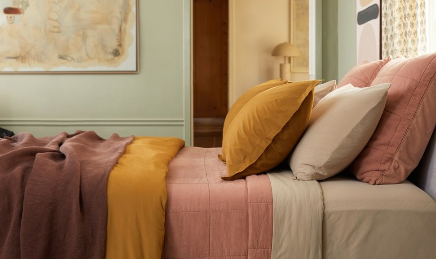
4. The ‘Sunset Pastel’ Palette: Dusty Rose, Peach, and Amber
Earth tones aren’t always dark. In 2026, we are seeing a rise in **’Earthy Pastels.’** These are colors derived from minerals—think of the ‘Painted Desert’ in Arizona.
**Dusty Rose** and **Muted Peach** are replacing the ‘Millennial Pink’ of the past. These new shades have a ‘muddy’ undertone that makes them feel mature and sophisticated. They work beautifully in bathrooms or small entryways, especially when paired with ‘Champagne Gold’ or ‘Muted Bronze’ fixtures. These colors catch the golden hour light in a way that makes the entire room feel like it’s glowing from within.
5. Implementation: The 60-30-10 Rule for 2026
To pull off these earthy palettes without the room feeling ‘heavy,’ follow the 2026 **Pro Rule**:
– **60% (Main Color):** Your lightest earth tone (e.g., Universal Khaki or Sage) on the walls.
– **30% (Secondary Color):** A medium-depth texture (e.g., Latte-colored curtains or a Terracotta rug).
– **10% (Accent Color):** The ‘grounding’ element (e.g., Matte Black lamp bases or a single deep Charcoal velvet chair).
By following this ratio, you ensure the ‘Earth’ feel stays balanced, airy, and expensive.
Summary: A Return to the Soil
In 2026, our homes are our sanctuaries. By leaning into earth tones, we are rejecting the ‘screen-blue’ of the outside world and embracing the ‘soil-brown’ of the real one. Whether you go for a light Soft Minimalist look or a deep Forest Drench, you are choosing a palette that is timeless, biological, and deeply comforting.