Color can completely transform a space, a design, or even a mood. When I first dipped my toes into interior design and digital art, I was overwhelmed by the number of color combinations out there. One that particularly caught my eye (and continues to be a favorite) is the tetradic color scheme.
Bold, vibrant, and full of contrast, it can bring any project to life—if used correctly. If you’ve ever wanted to master the art of using four colors in harmony, you’re in the right place. This guide will help you understand and balance a tetradic color scheme like a pro.
What Is a Tetradic Color Scheme?
A tetradic color scheme, also known as a double-complementary scheme, involves using two pairs of complementary colors. Think of it as a rectangle on the color wheel: for example, blue and orange, paired with green and red. This setup offers a rich palette with a wide range of tones, making it perfect for artists, designers, and even home decorators looking to create dynamic visual experiences.
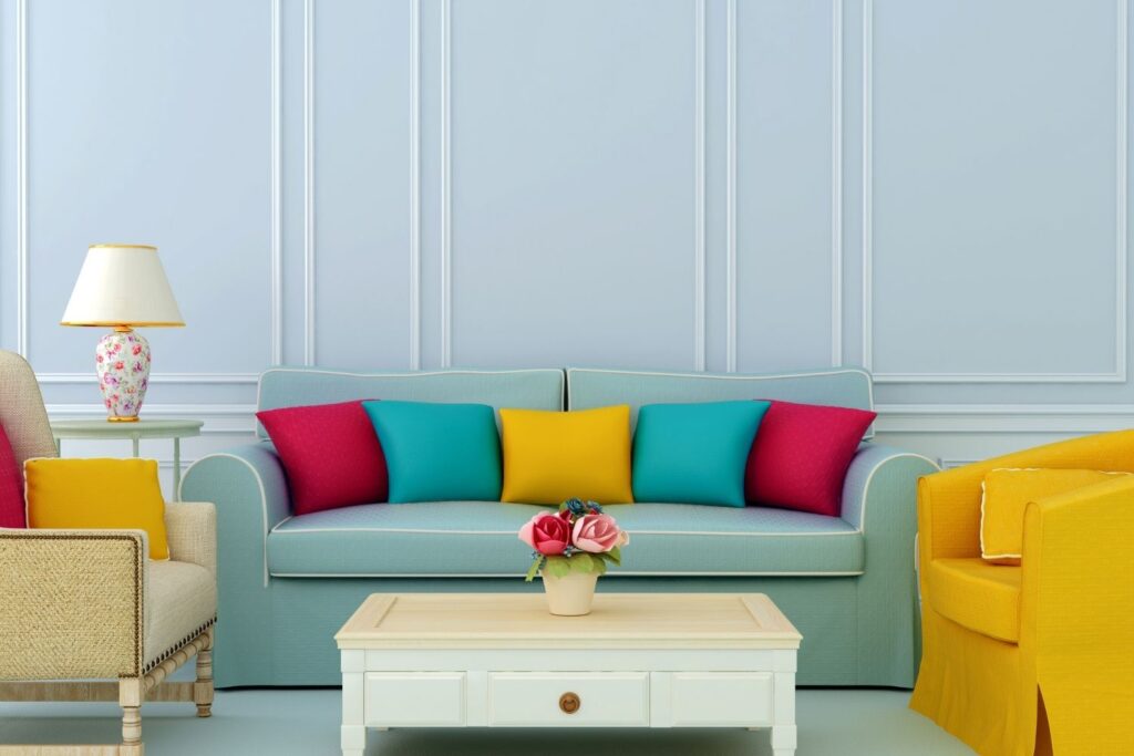
What makes the tetradic scheme so appealing is its versatility. Unlike monochromatic or analogous schemes, this one lets you play with opposites and similarities at the same time. However, because it involves four distinct hues, it requires a bit of finesse to prevent the design from looking chaotic.
How to Use a Tetradic Color Scheme in Interior Design
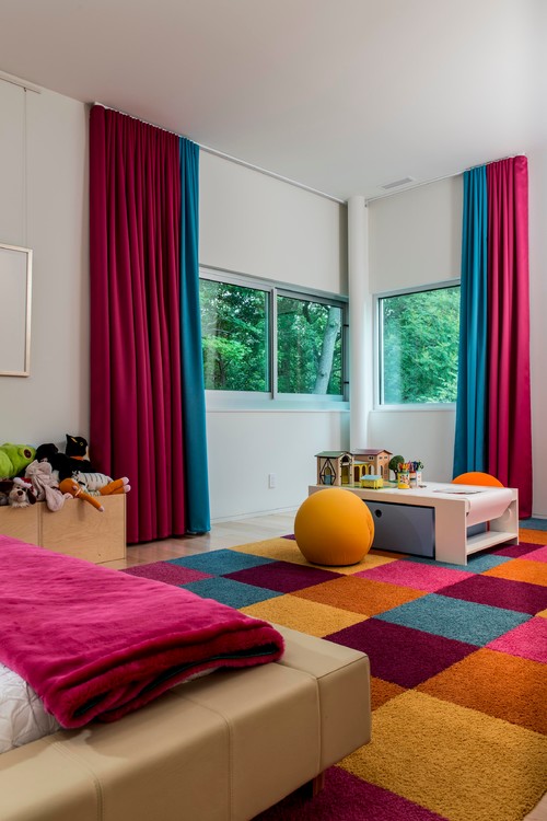
When I redecorated my living room, I chose a tetradic palette of teal, coral, mustard, and navy. At first, I worried it might be too much—but with some planning, it turned out beautifully. Here are a few tips I learned along the way:
- Choose one dominant color: Let one hue take the lead. In my case, navy set a calm foundation, while the other three played supporting roles.
- Use the 60-30-10 rule: This classic design principle helps maintain balance. Use the dominant color for 60% of the space, a secondary color for 30%, and the two accent colors for 10%.
- Balance warm and cool tones: In my palette, coral and mustard added warmth, while navy and teal provided cool contrast.
If you’re more of a visual planner, I highly recommend using tools like the Color Wheel Pro or digital palettes from apps like Coolors or Adobe Color. They make experimenting with tetradic combinations super easy.
Creating Harmony with the Tetradic Color Scheme
The trick to making a tetradic color scheme work is all about harmony. With four colors in play, it’s easy to go overboard. What saved me was being intentional about saturation and tone.
- Desaturate one or more colors: Not every color needs to be loud. I often tone down one of the secondary colors to prevent clashing.
- Match intensity: Keep all colors within the same brightness level for a more cohesive look.
- Stick with natural textures: When using a tetradic palette in physical spaces, natural elements like wood, linen, and stone help ground the boldness.
Avoiding Common Mistakes with a Tetradic Color Scheme
I’ll be honest—my first attempt at a tetradic color scheme was a bit of a disaster. I used all four colors equally, with high saturation, and the result was visually overwhelming. Here’s what I learned:
- Don’t use all four colors at full strength
- Avoid overly busy patterns that combine multiple hues
- Don’t ignore lighting: Light can drastically affect how colors are perceived, especially in interior spaces
Also, having the right tools made a big difference. I started using the LED Smart Light Panel Kit to test how my colors looked in different lighting conditions. Pair that with a Pantone Color Calibration Tool, and you’ll get much more reliable results, especially for printed designs.
Conclusion
Mastering the tetradic color scheme takes some practice, but it’s absolutely worth the effort. With the right balance, you can create designs that are bold, vibrant, and full of personality. Whether you’re decorating your home, designing a website, or creating digital art, this color scheme offers incredible versatility. The key is to let one color lead, balance the rest with intention, and use tools that make the process easier. Once you get the hang of it, you’ll wonder how you ever designed without it. So go ahead—pick your four colors and start creating something beautiful!