Biophilic Comfort: The 2026 Earth-Tone Revival
In 2026, home design has become far more intentional. As people spend more time working online, scrolling through digital platforms, and constantly interacting with screens, there has been a growing desire to make homes feel calmer and more restorative. This shift has pushed biophilic design into the mainstream, with homeowners focusing on colors and materials that feel connected to nature.
Earth tones have made a major comeback because they create spaces that feel warm, grounded, and relaxing without looking outdated. The modern version of this trend goes far beyond basic beige walls and dark brown furniture. Today’s earth-tone palette feels lighter, more layered, and far more sophisticated, with shades like terracotta, sage green, greige, and muted blues becoming popular choices for creating a balanced home environment.
The reason this trend has gained so much attention is because color affects how a space feels. Cooler neutrals can make rooms feel clean but sometimes cold, while warmer earth tones tend to make a space feel more welcoming. When used correctly, these colors can create depth and comfort without overwhelming a room.
The New Neutral: Sage Green
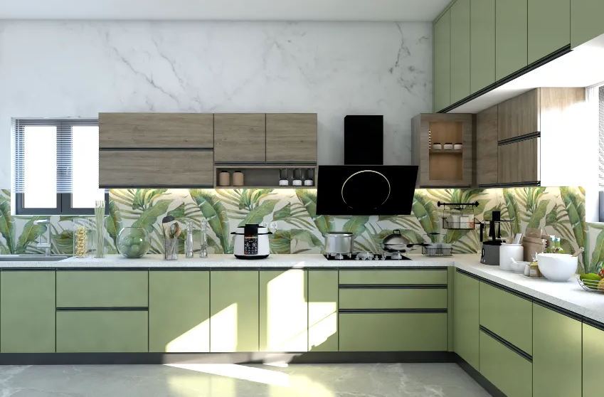
One of the biggest color trends in 2026 is sage green, which many designers now consider the new neutral. It offers more personality than plain white walls while still being subtle enough to work in almost any room. Sage feels soft and natural, which makes it especially popular in bedrooms, home offices, and living spaces where people want a calm atmosphere.
Many designers love sage because it pairs well with a wide variety of materials and finishes. It works especially well with light oak furniture, brushed brass accents, natural stone surfaces, and off-white textiles. The combination feels fresh and modern while still maintaining a warm, lived-in appearance.
If you’re unsure where to start with sage green, consider using it in smaller areas first:
- Accent walls
- Kitchen cabinets
- Throw pillows
- Bedding
These smaller updates can help introduce color without requiring a full redesign.
Terracotta: Bringing Warmth Into the Space
Terracotta has also returned in a much more refined way. Unlike the brighter orange tones that were popular decades ago, today’s terracotta shades feel softer and more natural. Burnt sienna, clay, rust, and muted cinnamon tones are now commonly used to bring warmth into modern spaces.
These shades work particularly well in homes that feel too minimal or overly neutral. A terracotta velvet chair, linen curtains, decorative pillows, or even ceramic décor pieces can instantly make a room feel warmer and more inviting. In larger spaces with high ceilings, terracotta can help make the room feel less empty and more comfortable.
The key is moderation. Too much terracotta can make a space feel heavy, which is why it often works best as an accent color rather than the dominant shade in a room.
The Role of Greige
Greige continues to remain one of the most practical foundation colors in 2026 because it sits between gray and beige. It offers the warmth of beige while maintaining the clean appearance of gray, making it extremely versatile for walls, larger furniture pieces, and flooring.
Many homeowners choose greige because it creates flexibility. It allows stronger colors like sage or terracotta to stand out without making the room feel overly colorful. It also works well in both modern and traditional homes, which is one reason it continues to remain popular.
A simple formula many designers use includes:
- Greige as the base color
- Sage as the calming accent
- Terracotta as the warm highlight
This combination creates balance while keeping the room visually interesting.
The Unexpected Accent: Slate Blue
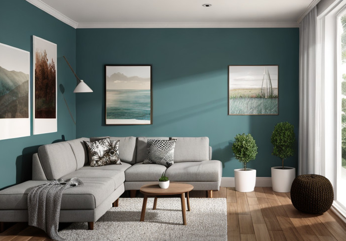
A modern earth-tone palette often needs a cooler shade to create contrast, and slate blue has become a popular choice for that purpose. Inspired by river stones and natural landscapes, slate blue adds depth without feeling overly bold.
It works particularly well in rugs, accent chairs, blankets, or decorative accessories. Pairing slate blue with beige sofas or warmer terracotta accents helps prevent the room from feeling flat or overly warm.
This contrast is what makes modern earth-tone spaces feel layered and thoughtfully designed.
Natural Materials Matter Too
Color is only one part of biophilic design. Materials also play an important role in creating a natural atmosphere. Many homeowners are combining earth-tone colors with organic materials such as wood, linen, stone, rattan, and clay.
These textures help reinforce the connection to nature while making spaces feel more relaxed and comfortable. Even small additions like woven baskets, ceramic vases, or wooden furniture can make a noticeable difference.
Final Thoughts
The earth-tone revival in 2026 is about creating homes that feel peaceful, warm, and connected to nature. Instead of relying on cold minimalism, people are embracing spaces that feel softer and more inviting.
By combining calming sage greens, warm terracotta shades, flexible greige tones, and cooler accents like slate blue, homeowners can create spaces that feel modern while still feeling deeply comfortable. When paired with natural textures and thoughtful design choices, these colors can transform any room into a space that feels like a true retreat from daily stress.